The Problem
Our Client, an alternative lender with products available across Canada, needed a new, clean, bright and refreshed website design, with updated content that was more relevant and consistent with their brand voice and tone.
The site needed to be responsively designed to work on all devices but definitely focussed on a mobile first approach as statistics showed that most of their customers used a mobile device to access the site and apply for one of their products.
Additionally, the application process for their site was outdated, confusing with inconsistent UI and language.
The Solution
New Technology
A new framework for the site was chosen to allow for faster load-time, better tracking and analytics leading to deeper insights as to how customers used the site which informed future updates and improvement.
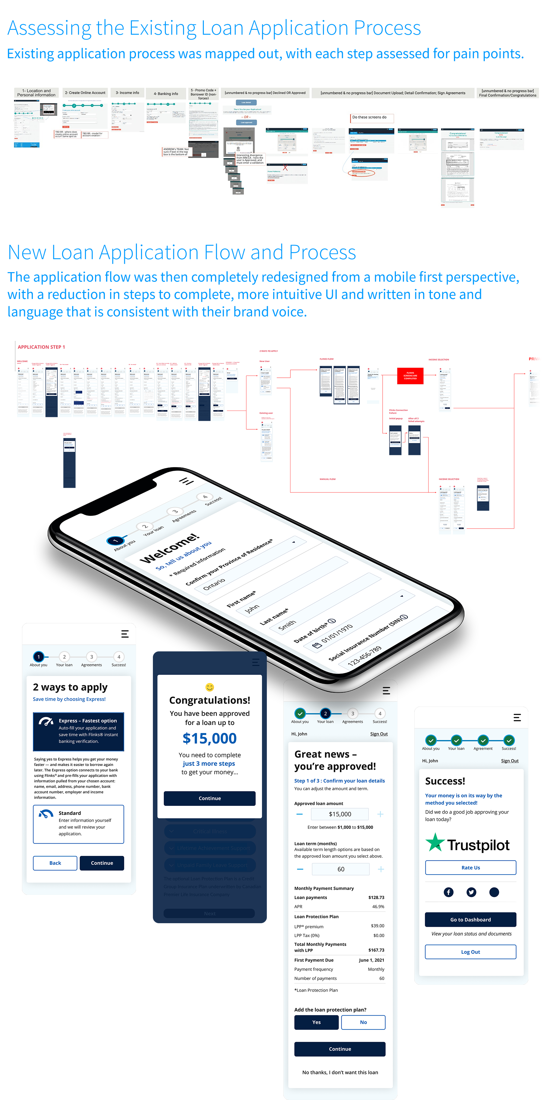
Loan Application
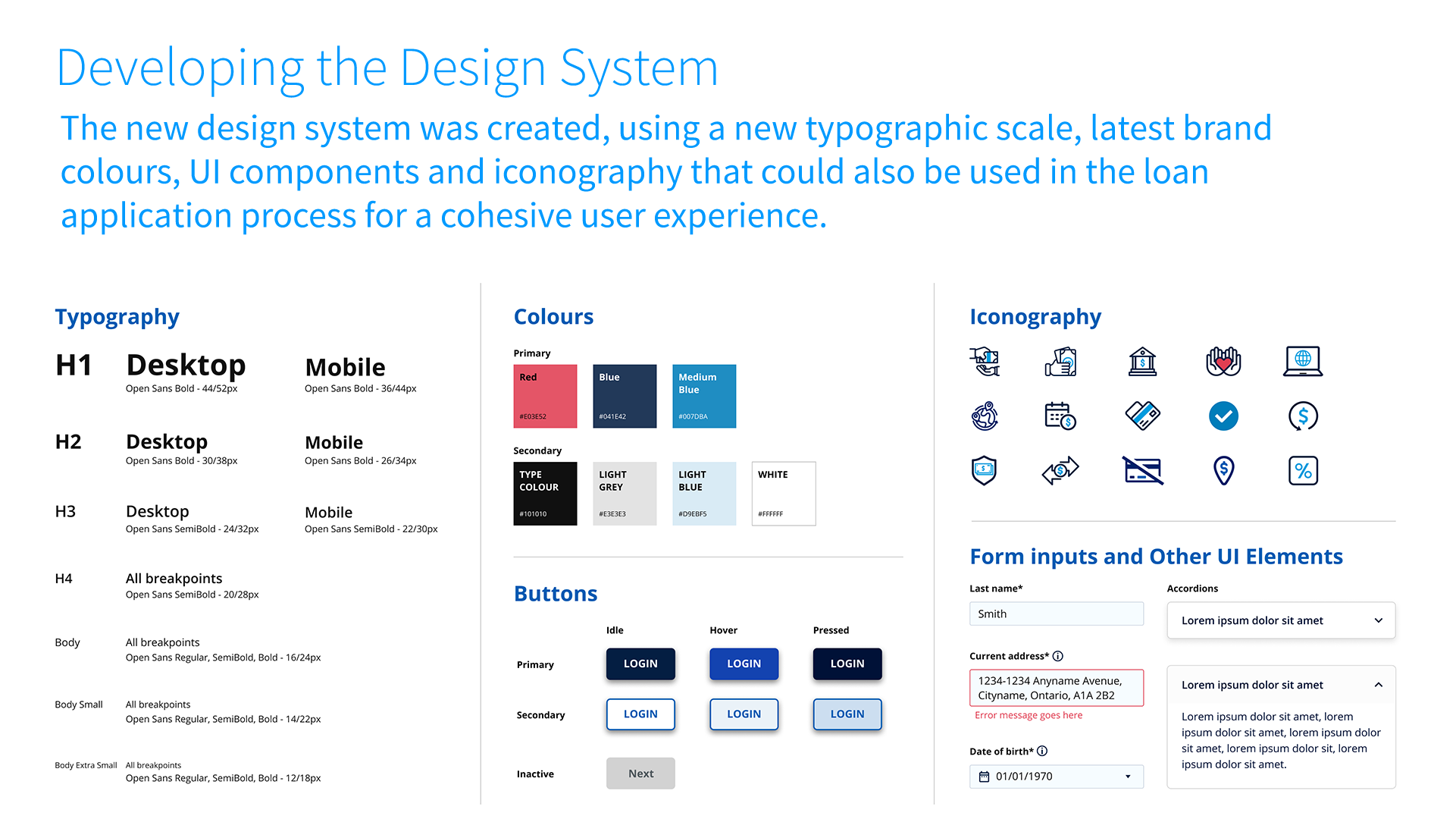
First, the application process was assessed for pain points, then defining a new UX and journey through the application process, creating a new design system including typography scale, colour usage, form inputs (and other UI), and setting rules for UX throughout. Language was updated to be consistent with their latest brand voice.
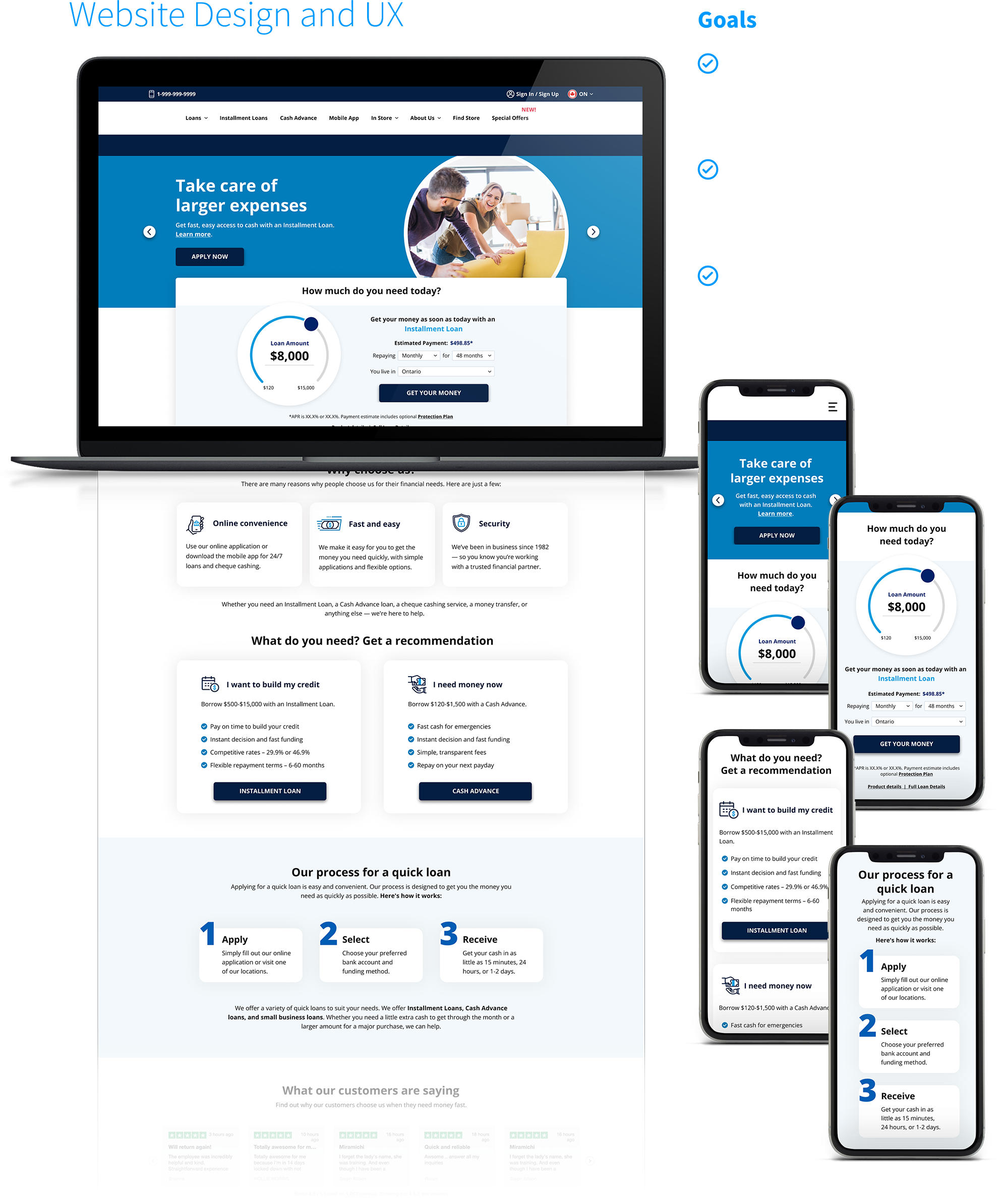
Website
The same design system developed for the loan application process was used as a building block for the website update. A full content review took place, and recommendations were made on which pages to keep, to remove and what new pages should be created. A design language and style for the site was developed in sync with the new content.
Additionally, new tools were created to offer product recommendations to the customer based on their needs. Clear CTA's were easily available to start the application process.
Website analytics were constantly studied, indicating where improvements could be made, be it through language, UI, UX or a combination of all of the above. The new calculator/product selector went through a significant UX/UI redesign based on site analytics and instantly out-performed the initial launch version.
It was important that both the site and application felt cohesive in look and feel but also from an experience perspective so you, as a User and customer, never felt like you were being ported to other sites to complete tasks as before.
Designed for Scalability
Additionally, the design system needed to look good but also be simple enough that other branches of the business could be quickly updated in a similar style.
My Roles: Content Strategist, User Experience, Visual Design, Art Direction